


Section 1: More Selector Forms
The universal, element, and class selectors were previously discussed.
- The universal selector is merely an asterisk (*) acting as a "wild card" to select any and all elements in the document.
- An element selector selects all instances of an element, specified by its tag name.
- A class selector can specify formatting for more than one type of tag, as long as the tag bears the given class name in its class attribute; the style class name begins with a dot (.) to distinguish it as a class.
There are other selector forms that allow greater specificity.
Combined Class and Element Selector
If you want to be more specific, you can use class and element selectors together.
- Also called a generic selector.
- These combinations can narrow down the specificity of your selectors, seeking out only the elements you want to style and leaving others alone.
- This is used to allow different occurrences of the same tag to use different style specifications.
For example,
p.narrow
{
letter-spacing: -1px;
}
p.wide
{
letter-spacing: 10px;
}
As with class selectors, a combined class is associated with a particular occurrence of an HTML tag by using the class attribute of the tag.
For example,
<p class = "narrow">Put narrow stuff here.</p>
<p class = "wide">Now for some wide stuff.</p>
Here is the output:
Put narrow stuff here.
Now for some wide stuff.
The above rules select only paragraphs (<p> tags) belonging to the "narrow" class or "wide" class.
- If a tag other than a <p> tag is associated with the "narrow" or "wide" classes by mistake, the rule will not apply to it.
- Other paragraphs not belonging to those classes are also left untouched.
id Selector
An id selector allows the application of a style to one specific element.
- The style id name begins with a hashtag or octothorpe (#) to distinguish it as an id.
General form:
#specific-id {property-value list}
Example:
#section14
{
font-size: 20px;
}
Your html tag (only one) must be linked to that id using the id attribute, like this:
<div id="section14"</p>
</div>
Difference between class and id:
- As with people, an id is unique to an individual (item).
- A class refers to a group.
/*
This is another id selector, which will
apply only to
a special paragraph. It should be used
ONE TIME ONLY
in your html! In the html simply add
id="odd-paragraph",
as in <p id="odd-paragraph">Halloween</p>
*/
p#odd-paragraph
{
color: orange;
font-size: 12pt;
font-weight: bold;
background-color: black;
display:inline; /* makes background only
the width of the text */
}
Additional Selector Forms
Contextual Selector
These are also referred to as descendant selectors.
The context of a selector is determined by what its parent element is.
- In other words, what the element is nested (or contained) within in the document.
For instance, if you wanted special formatting for an anchor tag inside a list item, you could write:
li a
{
font-family:Calibri;
color:red;
}
Pseudo Classes
Pseudo classes are styles that apply when something happens, rather than because the target element simply exists.
- Names begin with colons.
- "hover" classes apply when the mouse cursor is over the element.
- "focus" classes apply when an element has focus.
- a:hover MUST come after a:link and a:visited in the CSS definition in order to be effective.
- a:active MUST come after a:hover in the CSS definition in order to be effective
<!-- pseudo.html -->
<!DOCTYPE html>
<html>
<head>
<title>Pseudo Classes</title>
<style>
a:link {color:red} /* unvisited link
*/
a:visited {color:green} /* visited
link */
a:hover {color:fuchsia} /* mouse over
link */
a:active {color:blue} /* selected link
*/
</style>
</head>
<body>
<p>
<a href="http://www.isu.edu"
target="_blank">ISU</a>
</p>
<body>
<html>
Pseudo classes only work reliably with anchor tags, although some browsers allow pseudo classes to be used with form fields, etc., as in the example below.
<!-- pseudo.html -->
<!DOCTYPEhtml>
<html>
<head>
<title>Pseudo Classes 2</title>
<style>
input:hover { color: #ffffff;
background-color: #ff0000; }
</style>
</head>
<body>
<form method="get"
action="http://www.google.com/">
<input type="submit" value="click me"
/>
</form>
<body>
<html>
Read more at tizag's CSS Tutorial - Pseudo Class & Mouseover
There are even more complex selector forms to be seen in The 30 CSS Selectors You Must Memorize.
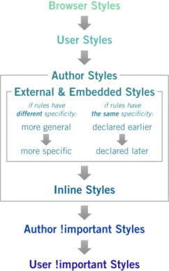
Section 2: Order Applied
Browser styles:
- If styles are not specified elsewhere, the browser uses a default style sheet to create as consistent a page appearance for unstyled pages as possible.
User styles:
- Browser styles are overridden by User styles.
- Some users create their own style sheets (e.g., a vision impaired person may use a style sheet in which the font is very large).
- How? Look it up in What Is a User Style Sheet?
Author styles:
- User styles are overridden by Author styles.
-
The rules described in the preceding sections are all called Author styles, and they
apply to documents as follows:
- All rules from external style sheets will apply to HTML documents that are linked to them or style sheets that import them.
- All rules from embedded style sheets will apply to the entire HTML document in which the style sheet resides.
- Rules in an inline style sheet will only apply to the element they style.
We explained the levels of style sheets earlier.
- Inline style sheets appear in the tag itself; specified for a specific occurrence of a tag and apply only to that tag.
- Document-level style sheets (also called embedded style sheets) appear in the head of the document; they apply to the whole document in which they appear.
- External style sheets are in separate files, and can be applied to any number of documents or even an entire site.
The cascade comes into play when rules conflict (like between Author styles and User styles or between an external style sheet and an inline style sheet), the more specific style takes precedence – inline styles will win over document-level and external styles; document-level styles will win over external styles.
In effect, the browser searches for a style property specification starting with inline, then document-level (embedded), then external until it finds that property (or there isn't a property).
If you want a rule in your external style sheet to win over document-level or inline style sheets, you can use the !important statement in the rule. For example, if you include the following in your external style sheet:
p { background-color: white !important; }
...and an inline style in your document, as below:
<p style="background-color:yellow">
Then the inline style would NOT override the paragraph style in the external style, because it included the !important statement. Thus, the paragraph will have a white background. (More in !important rules.)
If multiple external style sheets contain styles for the same tag, the sheet linked last will take precedence.
In other words rules cascade down from the top to the bottom, but browsers try to match rules from the bottom to the top:
Section 3: More on Fonts
text-shadow
text-shadow is a font property that adds a shadow to each letter
- See CSS Text Shadows for details.
-
/* adds a dark gray (#333) shadow a little to the right (0.1em) */
/* and down (0.1em) relative to the normal text. */
text-shadow: 0.1em 0.1em #333; - Example
@font-face
Downloaded fonts eliminate the need to depend on the limited number of fonts users have installed on their computers, and instead allows the browser viewing the web page to download a particular font from a server to render the page if the user has not got that font installed.
The @font-face rule allows a page to be linked to fonts that are automatically fetched and activated when needed. This allows authors to select a font that closely matches the design goals for a given page rather than limiting the font choice to a set of fonts available on a given platform.
- This means that web designers will no longer have to adhere to a particular set of "web safe" fonts that the user has pre-installed on their computer.
To use web fonts, each form of the font family must be declared using the @font-face rule.
-
For example, to use a specialized font like Italianno you would put
the following code as the first element in the <head> of your HTML document:
<link href='http://fonts.googleapis.com/css?family=Italianno'
rel='stylesheet'> -
Then assign it in a CSS selector using font-family:
.italianno
{
font-family: 'Italianno', cursive;
font-size: 2em;
font-weight: bold;
} -
And then use it in your html.
<p class="italiano">Demo of @font-face</p>
Demo of @font-face.
For more on @font-face, visit Google web fonts.
Section 4: Display Styles
Block-level vs. Inline
In previous versions of HTML, most elements were divided into two broad categories: block-level and inline.
-
A block-level element is one that contains a significant block of
content that should be displayed on its own line, to break apart
long passages of text into manageable portions such as paragraphs,
headings, and lists.
- Recall that block-level means that they typically are formatted with a line break before and after the element (thereby creating a stand-alone block of content).
-
An inline element usually contains a shorter string of text and
is displayed adjacent to other text on the same line, like a few
emphasized words within a sentence.
- An inline element has no line break before or after it.
- Inline elements are treated as part of the flow of document text; they cannot have margins, width or height set, and do not break across lines.
- Inline elements cannot be placed directly inside the body element; they must be wholly nested within block-level elements.
- Inline elements can only contain text and other inline elements.
The display style can now be specified by using the display property in CSS, which determines an element's formatting on the rendered page.
- If an element's display property is set to block (display:block;), the rendered element forms a "block box" and rests on its own, occupying the full available width unless some other width is specified.
- The value inline (display:inline;) indicates that the element appears on the same line as adjacent text or elements, and its width collapses to the width of its contents.
- There are additional settings, such as inline-block. this behaves like an inline element, meaning it can be on the same line as other elements, but it allows the height and width values to be set. It is very useful for buttons and other form elements.
Graphical web browsers have their own built-in style sheets that dictate how various HTML elements display by default, including whether they should be treated as block-level or inline.
- You can override these browser defaults with your own CSS, but it's important to know which elements are styled as block-level or inline by default.
Section 5: Float and Alignment
- The float property allows text to flow around other elements.
- If we have an element we want on the right, with text flowing on its left, we use the default text-align value (left) for the text and the right value for float on the element we want on the right.
-
.floatRight
{
float: right;
} -
<h2 class="floatRight">Floating Heading</h2>
<p>Example of text in a paragraph floating around a heading.</p>
<p>Lorem ipsum dolor sit amet, capto loquor, ventosus ad esse vulputate enim nimis. Quia inhibeo, nobis, fere nimis, plaga illum defui ideo. Quae uxor secundum pneum at amet. Brevitas abbas scisco pagus sed causa gemino vel praemitto autem olim diam singularis, ut natu.</p> -
Floating Heading
Example of text in a paragraph floating around a heading. Lorem ipsum dolor sit amet, capto loquor, ventosus ad esse vulputate enim nimis. Quia inhibeo, nobis, fere nimis, plaga illum defui ideo. Quae uxor secundum pneum at amet. Brevitas abbas scisco pagus sed causa gemino vel praemitto autem olim diam singularis, ut natu.
- More on float in the AtoZ CSS Screencast: Float and Clear and MDN Float.
-
If you do not want text to flow around the floated element, you can apply the
"clear" property to these following elements.
- The four options are "clear: left", "clear: right", "clear: both" or "clear: none".
- Get more details in Floats and "clear".
Left Align and Right Align Text on the Same Line
You can apply float:left and float:right to headings or paragraphs to position them on opposite sides of the page.
- You generally need to follow them with a div that has no content, but has the style "clear:both". See page source of the demo below for an example.
- See this CSS Tricks: Left Align and Right Align Text on the Same Line .
- Here is my heading alignment demo.
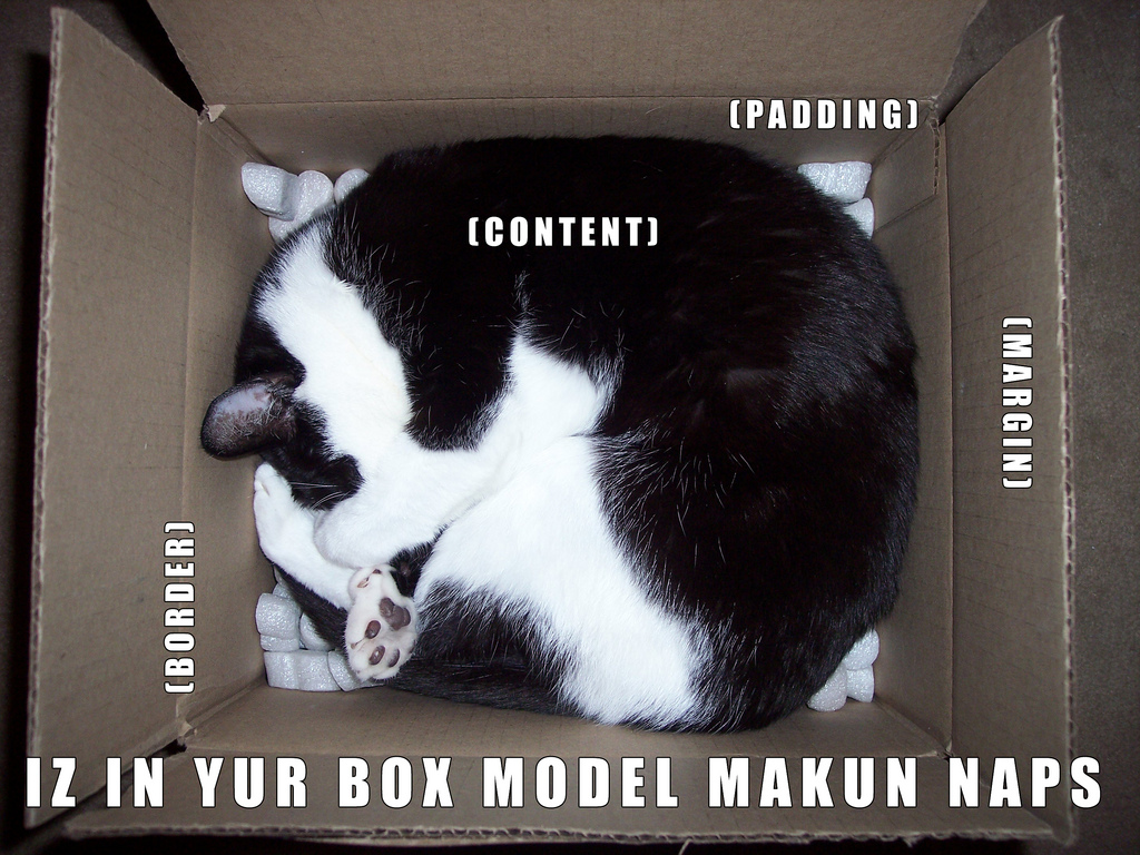
Section 6: Box Model
Each element in an HTML page defines a rectangular region that the browser uses to place the element in the browser window.
CSS has a collection of properties that describe various aspects of the formatting for the rectangle around each element that together make up what is referred to as the W3C's CSS box model.
The following diagram shows the properties that make up the box model and how they relate to each other:
Here is a good explanation of Managing the CSS Box Model.
Turble!
When specifying borders, margins, or padding four values can be declared at once by either specifying two or four values.
- When using the four value specification, the corresponding directions are: top, right, bottom, left, or TRBL.
- When only using two values, the first will define the top and bottom setting, while the second value will define the left and right setting.
Borders
-
Borders – every element has a border-style property
- Controls whether the element has a border and if so, the style of the border.
-
border-style
- border-style can be specified for any of the four borders or all of them.
-
values: none, dotted, dashed, double, solid, groove,
ridge, inset, outset
border-style: solid ridge outset groove;
– or –
border-top-style: solid;
border-right-style: ridge;
border-bottom-style: outset;
border-left-style: groove;
-
border-width
- border-width can be specified for any of the four borders or all of them.
-
values: thin, medium (default), thick, inherit or a
length value in px, pt, in, cm, mm, pc, em, ex, or %
border-width: 2px 2px thin thick;
– or –
border-top-width: 2px;
border-right-width: 2px;
border-bottom-width: thin;
border-left-width: thick;
-
border-color
- border-color can be specified for any of the four borders or all of them.
-
values: any color value, as described above
border-color:blue;
– or –
border-top-color: #33cccc;
border-right-color: maroon;
border-bottom-color: rgb(255,0,0);
border-left-color: SaddleBrown;
-
All at once
-
Settings for border-width, border-style, and
border-color can be specified with a single setting.
border: 2px solid #33cccc;
– or –
border-right: 2px solid #33cccc
border-left: 2px solid #33cccc;
border-top: 2px solid #33cccc;
border-bottom: 2px solid #33cccc;
-
Settings for border-width, border-style, and
border-color can be specified with a single setting.
Margins
-
Margin the space between the border of an element and its
neighbor element.
-
The margins around an element can be set with margin-left,
margin-right, etc., by assigning them a length value.
.floatLeft
{
float: left;
margin-right: 0.75em;
margin-bottom: 0.3em;
}<img class="floatLeft" src = "annieFace.gif" />
- See this link for the demo above.
-
The margins around an element can be set with margin-left,
margin-right, etc., by assigning them a length value.
Padding
-
Padding – the distance between the content of an element and its border.
padding: 2px 2px 2px 2px;
– or –
padding-top:0px;
padding-right:2px;
padding-bottom:2px;
padding-left:2px;
Background
The background properties include color, image, repeat, position, and attachment and apply to various elements (body, paragraph, table, etc.) See CSS Backgrounds at the W3Schools.
- Background color sets the background color of an element.
- Background image sets an image as the background.
-
Repeat sets if or how a background image will be repeated.
- Possible values: repeat (default), no-repeat, repeat-x, or repeat-y
-
Position sets the starting position of a background image
- Possible values: top left, top center, top right, center left, center center, center right, bottom left, bottom center, bottom right, x% y%, or xpos ypos
-
Attachment sets whether a background image is fixed or scrolls with
the rest of the page.
- Values include scroll or fixed.
- Here is a somewhat unsettling example of a fixed background.
Section 7: Hiding Elements
There are two main approaches for hiding an element in CSS:
- The display: none attribute.
- The visibility: hidden attribute.
The seconde approach leaves a gap in your page, so the first approach is more common.
display: none;
If you don’t want an element to display at all, you can set the value of the display property to none.
For example, to hide an entire portion of a web page, enclose it in a <div> tag and set the display property to none, as in the following example:
<!-- Hide it -->
<div style="display:none;">
<p>Stuff we want to hide.</p>
<p>More stuff we want to hide.</p>
</div>
To display the hidden portion, set the display property to block (or inline if the hidden element is an inline element like span):
<!-- Show it -->
<div style="display:block;">
<p>Stuff we want to hide and then show.</p>
<p>More stuff we want to hide and then show.</p>
</div>
visibility: visible;
The visibility property specifies whether or not an element is visible, but those hidden elements take up space on the page.
<!-- Hide it -->
<div style="visibility: hidden;">
<p>Stuff we want to hide and then show.</p>
<p>More stuff we want to hide and then show.</p>
</div>
<!-- Show it -->
<div style="visibility: visible;">
<p>Stuff we want to hide.</p>
<p>More stuff we want to hide.</p>
</div>
Section 8: Let's Play
Click the "Edit and Click Me >>" to see the results of the html code in the left panel in the panel on the right.
Then, play around with the html code, making changes and seeing the effect of those changes in the right panel.