


Section 1: Introduction
The jQuery library provides several techniques for adding animation to a web page, allowing developers to craft sophisticated custom effects.
- jQuery provides some basic and very useful animation effects to perform simple, standard animations that are frequently used right out of the box: Category: Effects
- In addition to the animations provided by jQuery's animation effect, the
animate()method can be used to craft sophisticated custom animations: jQuery Effects - Animation
The basic (built-in) animation effects include
Section 2: Using Effects
Basic Animation Signature
Based on the following:

actionis the animation method that will be called, including .hide(), .show(), .slideUp(), .slideDown(), .fadeIn(), .fadeOut(), .fadeTo(), and .toggle().durationis how long the animation should take, i.e., duration of the effect in milliseconds or one of the predefined strings: "slow" (600ms), "normal" (400ms), or "fast" (200ms). The default is "normal".completedis the method that will run when the animation has completed.
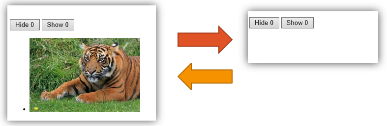
Using Hide and Show

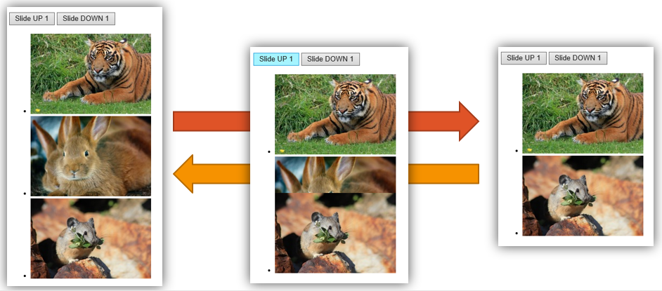
Using SlideUp and SlideDown

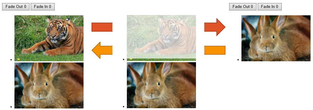
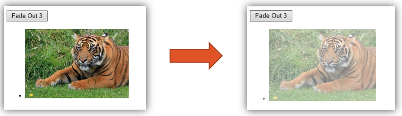
Using FadeIn and FadeOut

Using FadeTo

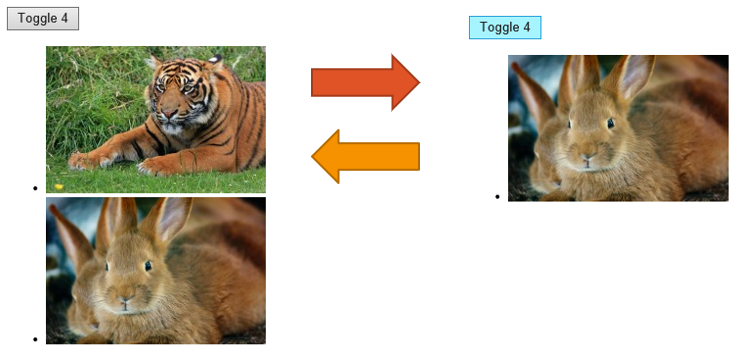
Using Toggle

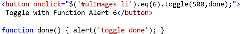
Completed parameter
The previous examples demonstrated action and duration, and now we'll look at completed.
completed is the method that will run when the animation has completed, and a function can be defined here.

Section 3: Animate Function
The previous examples used the basic action signature, but the focus now turns to the animate() function.
The animate() function is used to create custom animations, typically by animating
various CSS properties.
The animate() function signature follows:
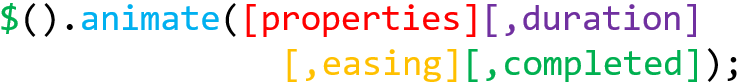
propertiesrefers to the Property Object of the CSS properties to change to during animation.durationis how long the animation cycle should take.easingis also called timing, and specifies the speed at which the animation progresses.- The jQuery library provides two easing functions: linear and swing.
completedspecifies the method that will run when the animation has completed.
Examples
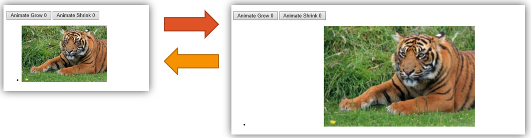
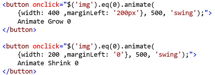
In the following demo, a custom animation makes the image appear to pop, by altering both the width and margin-left CSS properties , with a duration set to 1 second and the easing parameter set to swing.
Here is the critical code for the demo:
Section 4: CSS Animations and Transitions
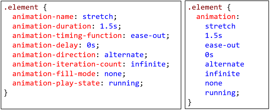
Animations are used to animate the values of CSS properties over time, using keyframes.
- There is an implicit transition with start and end states defined.
- Can be started immediately.
- CSS Animations: A Complete Guide in 7 Levels of Difficulty provides a worthwhile tutorial.
- For the module documentation visit W3C's CSS Animations Level 1.
Transitions are used to perform animations.
- There is an explicit transition based on when to start, the duration, and the type of flow.
- An event, like hover, is required.
Example
<!DOCTYPE html>
<html>
<head>
<meta charset="utf-8" />
<title>Testing CSS Animations</title>
<style>
#ani, #trans {height: 100px;width: 100px;background-color: #F00;}
#ani:hover {animation: changeColor linear 3s;}
@keyframes changeColor {
from {background-color: #F00;}
to {background-color: #00F;}
}
#trans {
transition: background-color linear .5s, width ease-in-out 3s;
}
#trans:hover {
background-color: #00F;width: 500px;
}
</style>
</head>
<body>
<p>Hover over each square to see CSS animation.</p>
<div id="ani"></div>
<div id="trans"></div>
</body>
</html>
Note that jQuery is not needed for pure CSS animations.
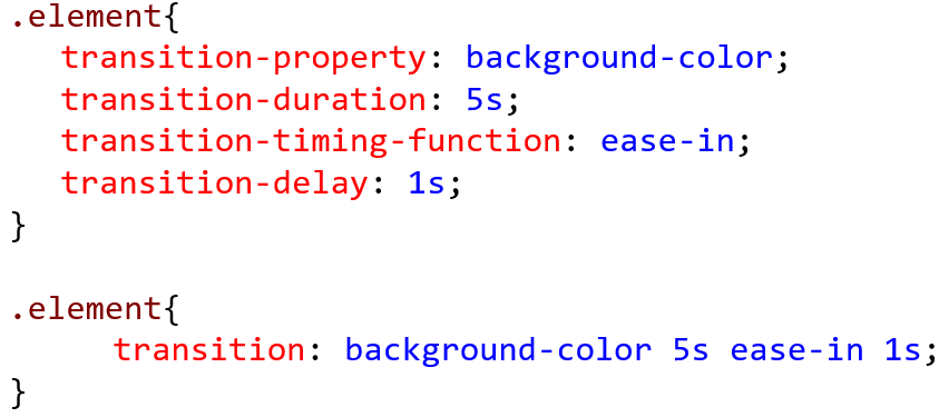
Syntax
The two forms of syntax below work the same:
A discussion can be found at CSS Tricks: animation
Similarly, the second example below is a shorthand version of the first: