


Section 1: Introduction
jQuery UI is a curated set of user interface interactions, effects, widgets, and themes built on top of the jQuery JavaScript Library. Whether you're building highly interactive web applications or you just need to add a date picker to a form control, jQuery UI is the perfect choice.
from jQuery User Interface
jQuery UI is a powerful JavaScript library built on top of jQuery JavaScript library. UI stands for User Interface. It is a set of plug-ins for jQuery that adds new functionalities to the jQuery core library.
from jQuery UI - Overview
Features
jQuery UI is categorized into four groups:
- interactions
- widgets
- effects
- utilities
The structure of the library is as shown in the image below:
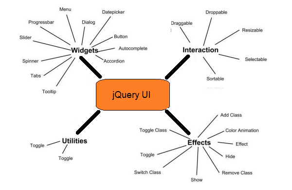
- Interactions − These are the interactive plugins like drag, drop, resize and more which give the user the ability to interact with DOM elements.
- Widgets − These are jQuery plugins used to create user interface elements like accordion, datepicker, etc.
- Effects − Built on the internal jQuery effects, these contain a full suite of custom animations and transitions for DOM elements.
- Utilities − These are a set of modular tools the jQuery UI library uses internally.
Benefits of jQuery UI
- Cohesive and consistent APIs.
- Comprehensive browser support.
- Open source and free to use.
- Well documented.
- Powerful theming mechanism.
- Stable and maintenance friendly.
- Pre-built and ready to use.
Summary
-
jQuery UI is
- a library
- Open source
- Free
- Must be linked to your website.
-
Dependent on jQuery
- Versions need to "match"
Linking
Visit jQuery CDN – Latest Stable Versions and scroll down to the jQuery UI section.
If you click on the uncompressed or minified link, the result is a recommendation to link jQuery to your page using the following code:
<script src="https://code.jquery.com/ui/1.12.1/jquery-ui.js"
integrity="sha256-VazP97ZCwtekAsvgPBSUwPFKdrwD3unUfSGVYrahUqU="
crossorigin="anonymous">
</script>
The integrity and crossorigin attributes are used for Subresource Integrity (SRI) checking.
This allows browsers to ensure that resources hosted on third-party servers have not
been tampered with. Use of SRI is recommended as a best-practice, whenever libraries
are loaded from a third-party source. Read more at srihash.org.
The web page must include a link to both jQuery and jQuery UI.
Be sure to include the link to jQuery before the link to jQuery UI!
Section 2: Categories
The previous image indicated that jQuery UI is categorized into four groups, interactions, widgets, effects, utilities.
- Utilities are a set of modular tools the jQuery UI library uses internally, so we'll focus on the following categories:
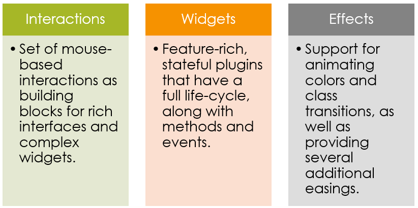
Interactions
jQuery interactions provide mouse-based interactivity that lets visitors move or alter elements on a page.
Widgets
A widget is an element of interaction in a graphical user interface, such as a button or a date picker.
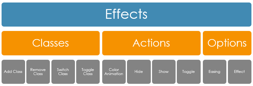
Effects
Effects include changes in color, motion, form, or spatial position (referred to as preattentive visual properties) to enhance visual appeal.
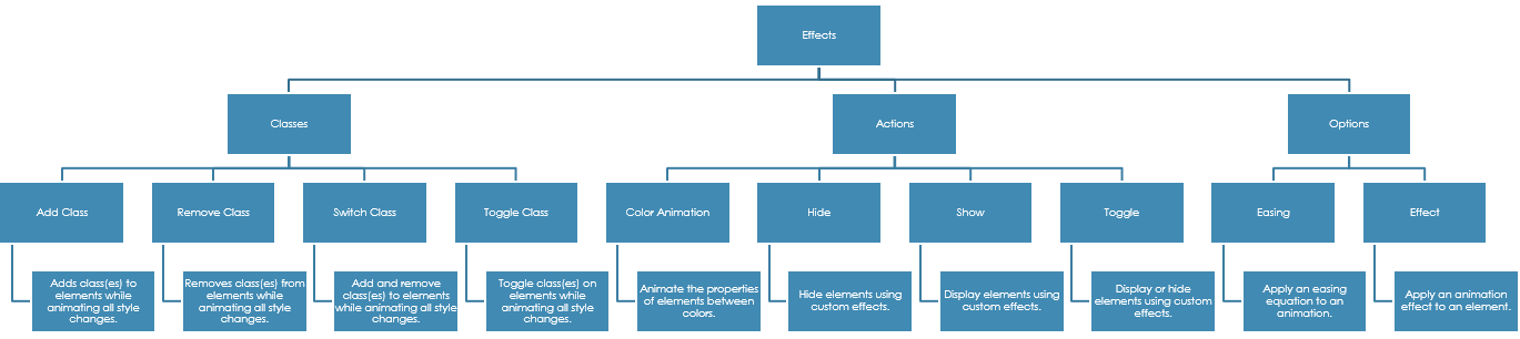
jQuery UI effects fall into three groups: classes, actions, and options
This diagram is similar to the one above, but includes descriptions in the lower tier.
Section 3: Interactions
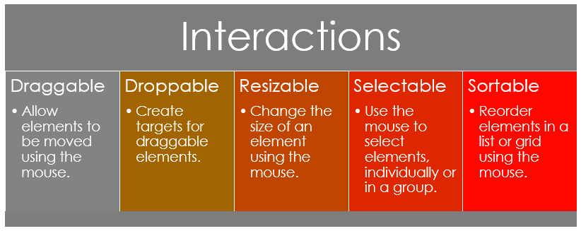
Interactions include
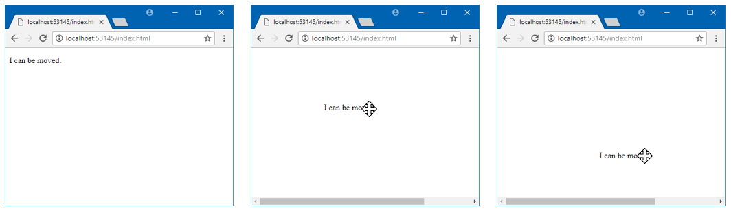
Draggable
Allows an element to be dragged about the page.

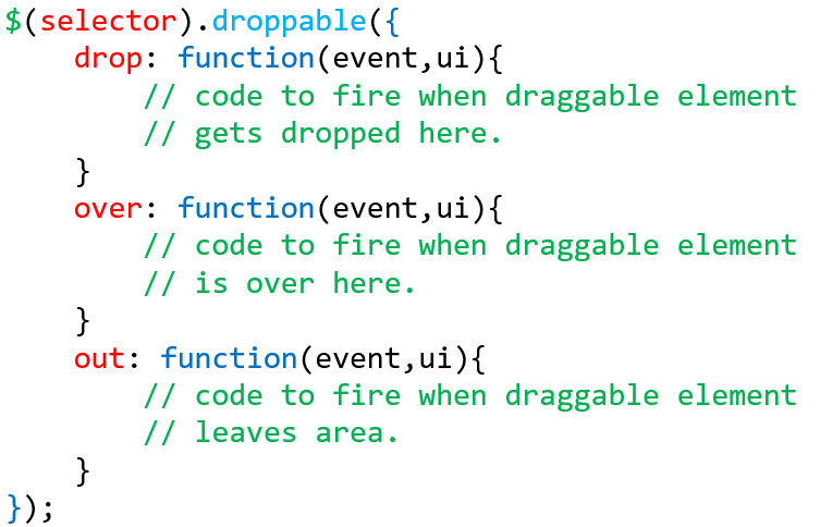
Droppable
A draggable element can be dropped in a droppable element.

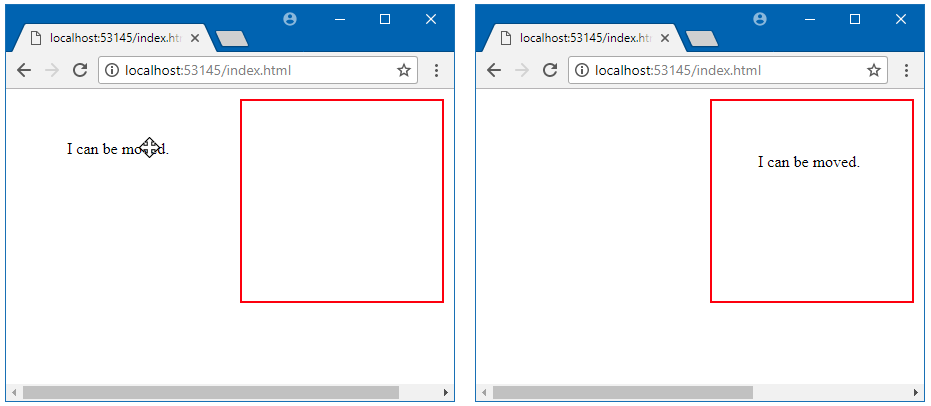
What to do when dropped:
Resizable
Allows an element to have draggable resizing handles.

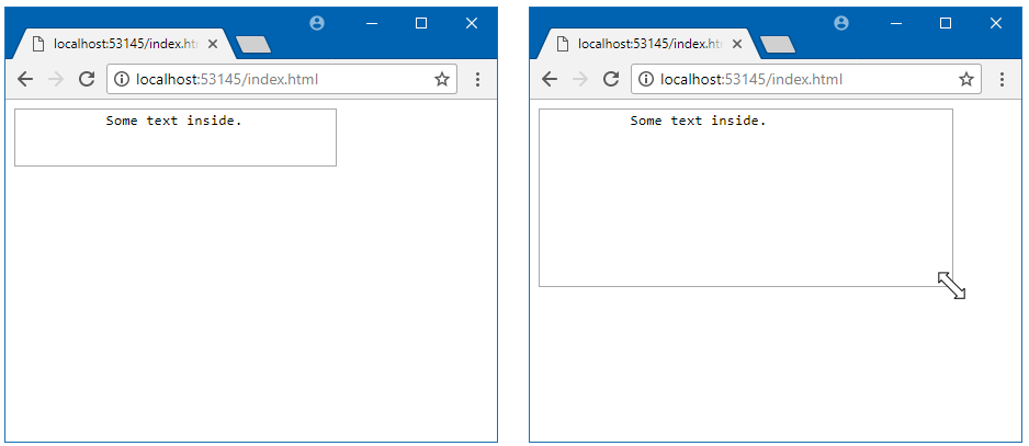
Works on all kinds of elements:
In order to get the following demo to work, the following link had to be included in the <head> section:
<link rel="stylesheet" href="//code.jquery.com/ui/1.12.1/themes/base/jquery-ui.css">
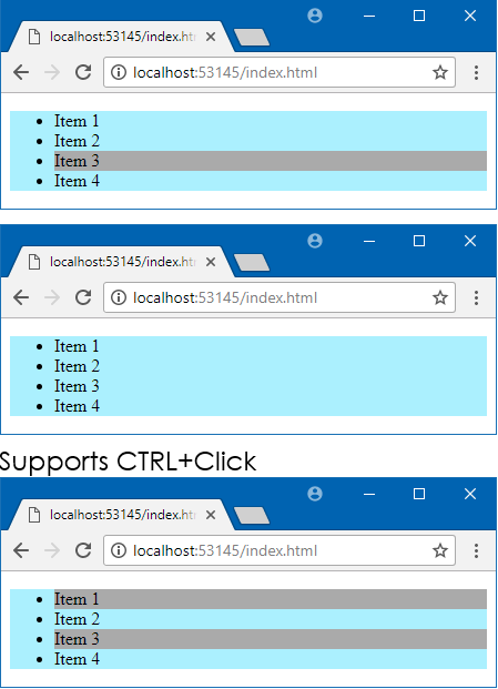
Selectable
Allows a list of element to be "selectable".

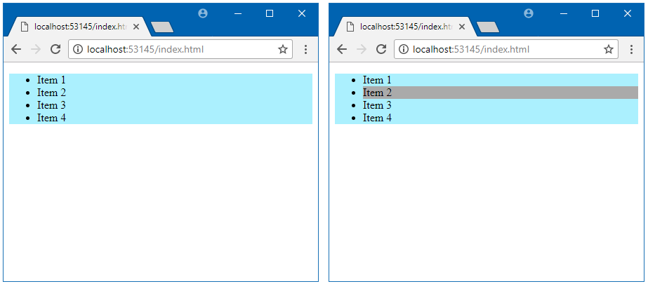
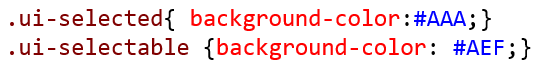
Styling for Selectable
You can set the style while being selected and after being selected using .ui-selecting and .ui-selected respectively.
- .ui-selecting → Triggers while selecting (holding your mouse button on an element)
- .ui-selected → Triggers when an element has been selected
For more details on styling, visit any of the following:
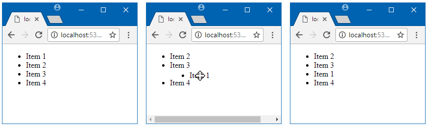
Sortable
Allows a list of elements to be rearranged in the DOM.

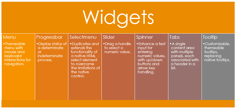
Section 4: Widgets
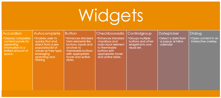
Widgets are user interface elements, and include the following:
- Accordion
- Autocomplete
- Button
- Checkboxradio
- Controlgroup
- Datepicker
- Dialog
- Menu
- Progressbar
- Selectmenu
- Slider
- Spinner
- Tabs
- Tooltip
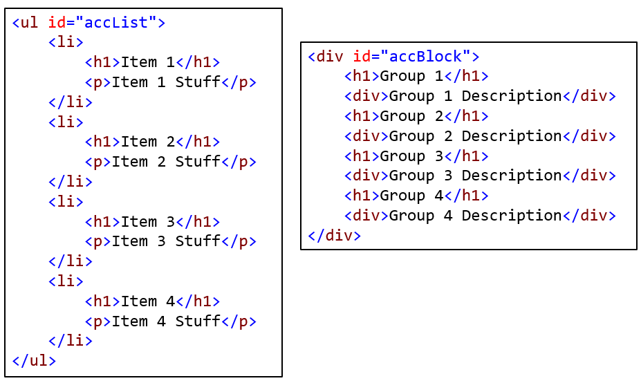
Accordion
Creates a sliding accordion.

Requires: [Header : Content] pair model
- Header: h1, h2, h3, etc.
- Content: block element immediately following header.
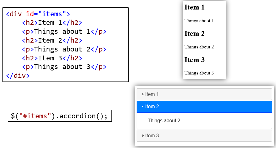
Both of the following approaches work:
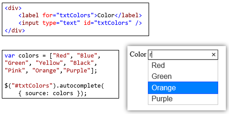
AutoComplete
Checkboxradio
Radio Button
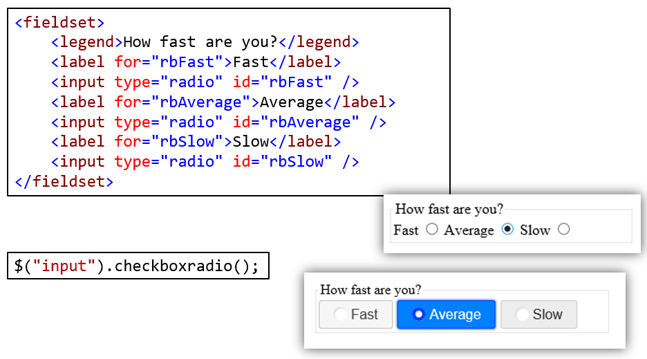
Recall that a radio group is defined by giving each of the radio buttons in the group the same name.
- Once a radio group is established, selecting any radio button in that group automatically deselects any currently-selected radio button in the same group.
In the demo below, each radio button was assigned the same name to prevent multiple selections.
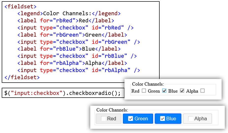
Checkbox
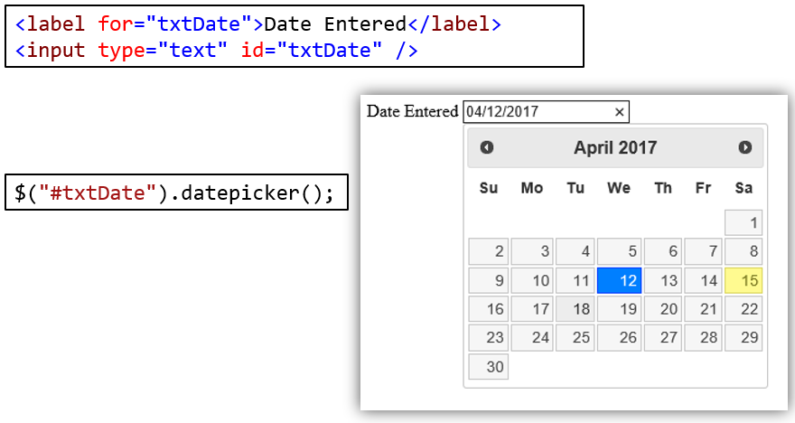
Datepicker
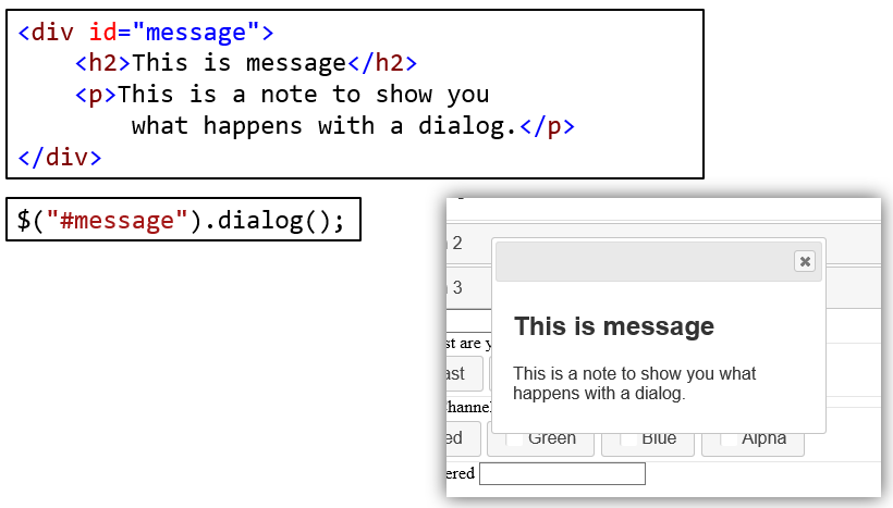
Dialog
Menu
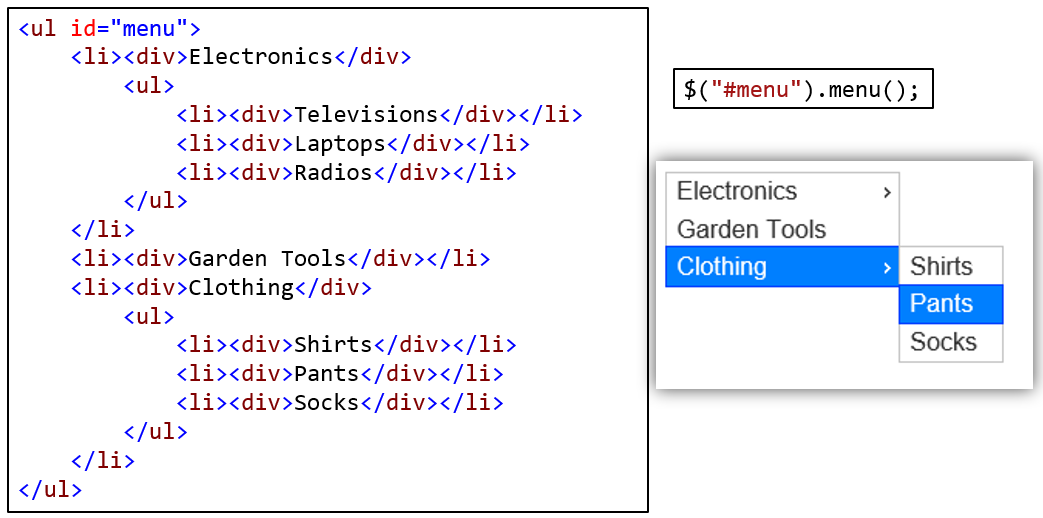 " target="_blank">Menu Demo
Note that the menu cannot be 100% wide or the submenus will not display.
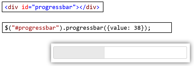
Progressbar
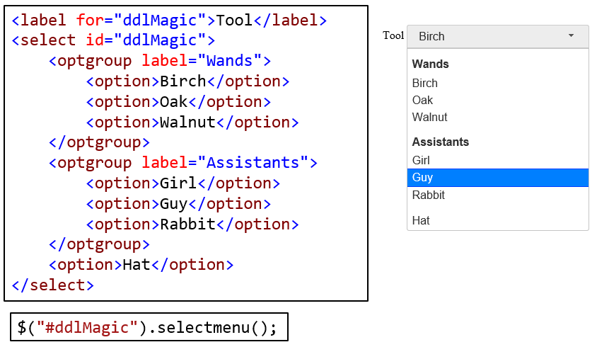
Select Menu
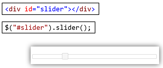
Slider
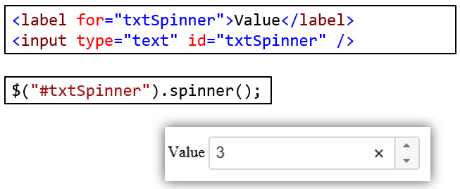
Spinner
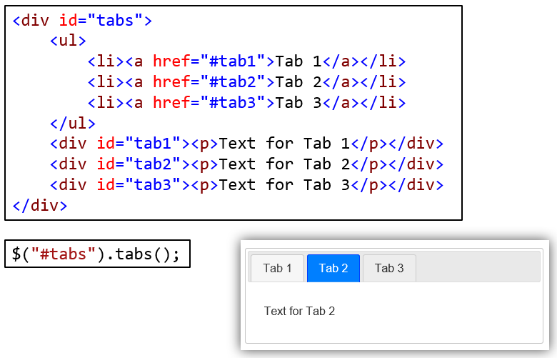
Tabs
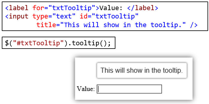
Tooltip
Section 5: Themes
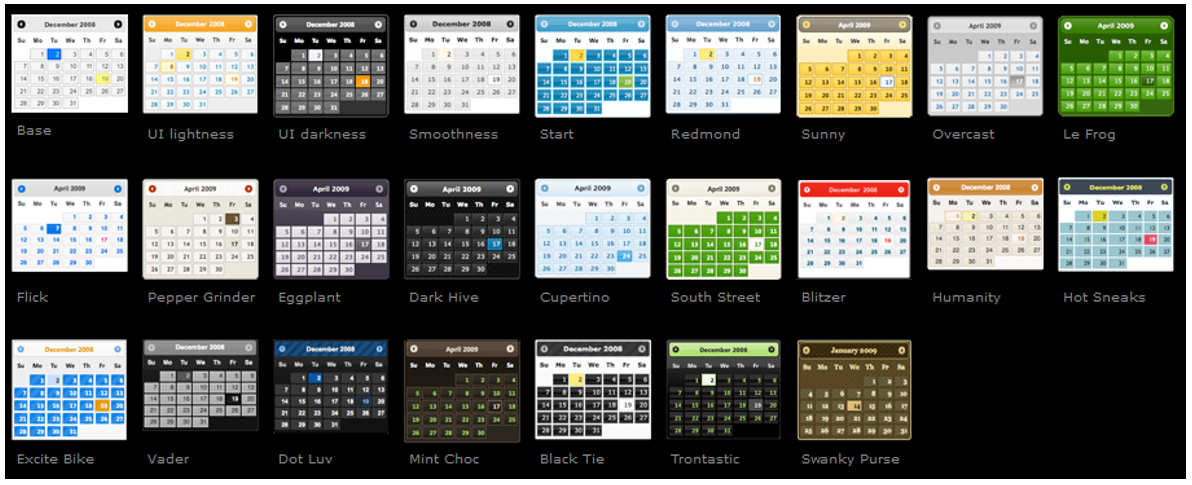
Pick from existing themes (Gallery)
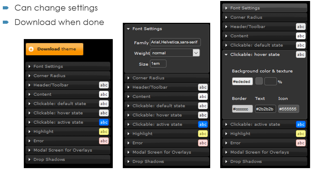
Themes can be customized.
Read more about themes at