Section 0: Module Objectives or Competencies
| Course Objective or Competency | Module Objectives or Competency |
|---|---|
| The student will be able to explain the differences between web-based systems and conventional systems. | The student will be able to explain how considerations such as a quality site design plan contribute to the success of a web-based system. |
| The student will be able to explain how considerations such as the purpose and intended audience contribute to the success of a web-based system. | |
| The student will be able to explain how considerations such as site structure contribute to the success of a web-based system. | |
| The student will be able to explain how considerations such as page design contribute to the success of a web-based system. |
Section 1: Introduction
While few people realize how much work goes into planning and developing a good design plan, the overall design of a website is critical to its success.
A psychology professor at Carleton University found that Internet users judge whether they like or dislike a website in one twentieth of a second based on the web site's "visual appeal."
- Through the halo effect, first impressions can color subsequent judgments of perceived credibility, usability, and ultimately influence purchasing decisions.
- Creating a fast-loading, visually appealing site can help websites succeed.
- This makes design considerations hugely important.
Further, several studies have shown that the quality of page design is an indicator of credibility.
- Elements such as layout, consistency, typography, color, and style all affect how users perceive your website and what kind of image you project.
- Your website should project not only a good image but also the right one for your audience.
- Other factors that influence credibility include the quality of the website's content, number of errors, and ease of use.
- Website Usability: 155 Tactics To Improve UX In 2023
- 9 Guidelines & Best Practices for Exceptional Web Design and Usability
- Website Usability Guide
- 18 Usability Guidelines and Website Design Standards
Section 2: Primary Considerations
When designing a web site, it is absolutely essential to remember your purpose and your audience.
- Simple questions like 'what is this site for?' and 'who is this site for?' will dictate several smaller aspects of design.
Purpose
The purpose of the site should serve to remind you that functionality is at least as important as appearance.
- The purpose of your site reflects your reasons for building the site, i.e., what your website is meant to do for you.
-
Considering websites from the perspective of a business, every investment
under consideration must clearly answer the question "Why?".
- The purpose or objective should specify its results.
- The purpose or objective should describe what will change when attained.
- The purpose or objective should be measurable and provide criteria for success.
- Content is dictated by the purpose.
- A website can be a work of art, but if it doesn't serve its purpose then it's effectively worthless.
Some examples of web site purposes include
-
Informational
- company presence and profiles
- descriptions of products and services
- reference or training materials
- news
- calendars of events
-
Search
- database search
- technology investigation
-
Transactional
-
catalogs, orders, sales
- behave like traditional applications
- financial services
-
catalogs, orders, sales
-
Communication facilitation
- customers, suppliers, employees
- social networking
-
Entertainment
- games
- tv shows
- videos
- music
These links discuss purpose:
- What’s the Purpose of Your Website?
- What Is the Purpose of A Website?
- The Purpose Of A Website For A Business & Why You Need One
Audience
Defining the audience is a key step in the website planning process.
- The audience is the group of people who are expected to visit your website – the market being targeted.
- People will be viewing the website for a specific reason and it is important to know exactly what they are looking for when they visit the site.
- A clearly defined purpose or goal of the site, as well as an understanding of what visitors want to do or feel when they come to your site, will help to identify the target audience.
-
Upon considering who is most likely to need or use the content,
compile a list of attributes common to the users including:
- audience characteristics
- information preferences
- device specifications
- web experience
Considering the characteristics of the audience will allow an effective website to be created that will deliver the desired content to the target audience.
These links discuss audience:
Section 3: Site Structure
Site structure is a larger aspect of design that will often be decided by the purpose.
- If we have only a vague idea how one section of the web site relates to other areas, or if we have no comprehensive narrative or clear sense of organization, the readers will recognize that and many of them will leave in pursuit of better-organized material.
You could think of the structure of a website as how it would look if you printed every single page and arranged them on the floor of a room.
There are a few main structures:
-
Sequential
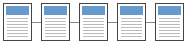 Sequential structures are
linear in nature; they are well suited for training or
instructional sites.
Sequential structures are
linear in nature; they are well suited for training or
instructional sites.- A sequential structure is the simplest way to organize information because it presents a linear narrative.
- Sequential ordering may be chronological, a logical series of topics progressing from the general to the specific, or even alphabetically sequenced, as in indexes, encyclopedias, and glossaries.
- Simple sequential organization usually only works for smaller sites (or structured lists like indexes), because long narrative sequences often become too complex to remain understandable.
- More complex web sites may still be organized as a sequence, but each page in the main sequence may have one or more pages of digressions or links to information in other web sites.
-
Grid
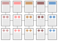 A grid structure is useful for
information that shares a highly uniform structure of topics and
subtopics, with no particular hierarchy of importance among the
topics.
A grid structure is useful for
information that shares a highly uniform structure of topics and
subtopics, with no particular hierarchy of importance among the
topics.- Grids are a good way to correlate variables, such as a number of standard categories such as "events," "chapters," etc.
- To be successful, the individual units in a grid must share a highly uniform structure of topics and subtopics.
- Many procedural manuals, lists of university courses, or medical case descriptions are best organized as a grid.
- Unfortunately, grids can be difficult to understand unless the user recognizes the interrelationships between categories of information, and so are probably best for experienced audiences who already have a basic understanding of the topic and its organization.
-
Hierarchical
 Hierarchical
structures are useful for organizing complex bodies of
information, like Amazon.com.
Hierarchical
structures are useful for organizing complex bodies of
information, like Amazon.com.- Hierarchical organization schemes are particularly well-suited to web sites, because web sites should always be organized as off-shoots of a single home page.
- Most users are familiar with hierarchical diagrams, and find the metaphor easy to understand as a navigational aid.
- Since hierarchical diagrams are so familiar in corporate and institutional life, users find it easy to build mental models of the site.
-
Web
 A web-like organizational structure like
Wikipedia mimics
associative thought and free flow of
ideas.
A web-like organizational structure like
Wikipedia mimics
associative thought and free flow of
ideas.- The goal is to fully exploit the web's power of linkage and association by allowing users to follow their interests in a pattern unique to each person who visits the site.
- Web-like structures are often the most impractical structure for web sites, because they are so hard for the user to understand and predict.
- Web-like structures work best for small sites dominated by lists of links, aimed at highly educated or experienced users looking for further education or enrichment, not for a basic understanding of the topic.
Most complex web sites share aspects of all four types of information structures. Users are likely to use any web site in a free-form "web-like" manner, just as most reference books are used.
However, the nonlinear usage patterns typical of web surfers do not absolve the designer of the need to organize the content and present it within a clear, consistent structure that complements the design goals for the site.
Section 4: Page Design
For any website the first design consideration should be usability.
- The primary reason for the website is the user of the website.
When it comes to actually designing pages, there are literally hundreds of things that could be discussed, but we'll cover only the most important aspects of page design.
Fonts
- Use standard web fonts such as Arial, Times, Courier, Georgia, Verdana, etc.
- Avoid polarizing fonts like Comic Sans and others.
- You can find more on font selection through the following links:
Colors
Subtle things like color choice can end up making a big difference on the overall design of a page.
- A soft color shade or white usually makes the best choice for background.
- Be careful not to get too wild with colors; they should suit the theme and purpose of the website.
- Text should be of sufficient contrast to the background to be readable. For more details, see Good vs Bad – Color Palettes.
- Too many colors, clashing colors, or very garish colors all distract (and detract) from your site's content.
- Stick to a simple palette and use it consistently.
According to an article from a web design business, research reveals that when humans assess an item like a web page, between 62% and 90% of that assessment is based on color alone.
- It is important to set the tone for the user by picking colors that complement the purpose of the website.
- Each color provides a different feel to the website.
- Compare this same site, first using their original color scheme and then the modified version.
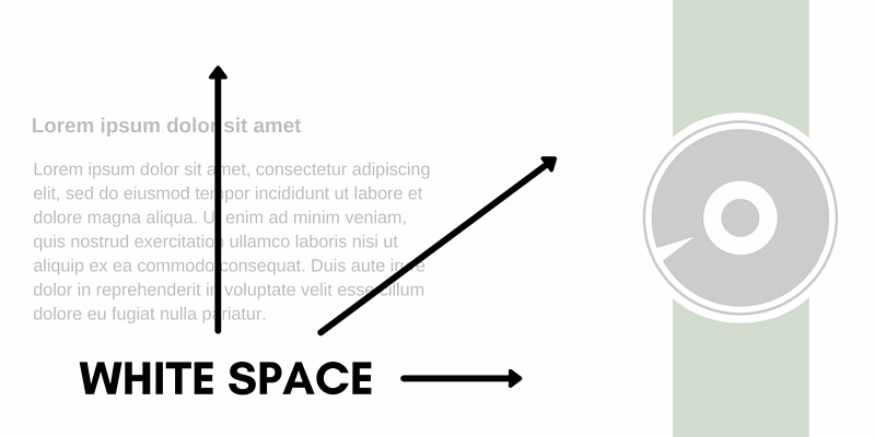
White Space
White space is the empty space between paragraphs, pictures, buttons, and other items on the page.
- White space declutters a page by giving items room to breathe.
- Items can be grouped together by decreasing the space between them and increasing the space between them and other items on the page.
- This is important for showing relationships between items (e.g., showing that one button applies to a particular set of items) and building a hierarchy of elements on the page.
White space also makes content more readable.
- Proper use of white space between and around text elements increases comprehension by almost 20% (White Space Explained).
- Readers find it easier to focus on and process generously spaced content.
Consistency
The selected design should be used consistently.
- Doing so will help to establish a site's identity and will help to decrease confusion for your users, because visitors don't have to learn new tricks as they move around.
Sites need to be externally consistent, that is, consistent with general practice.
- Users will tend to apply rules they've learned elsewhere, even if those rules don't actually apply to the current site.
- They bring to your site their own experience and expectations.
- If you ignore that, you risk causing confusion and alienation.
Sites also should be internally consistent: standards and conventions should be established and applied throughout all the content.
- For example, a user who encounters the "Search" at the top right on one page will have problems if it's arbitrarily moved to different locations on other pages of the site.
Consistency should apply to (at least) the following:
-
Language
-
The use of multiple terms for the same thing is a significant
cause of confusion.
- You can minimize this confusion by using only commonly accepted terms.
-
You should also have a consistent "voice".
- Don't switch from warm-and-friendly on one page to legalistic on another.
- Consistent language will make your site appear simpler and more authoritative.
-
The use of multiple terms for the same thing is a significant
cause of confusion.
- Layout
- Existing general practice constrains what you can do because people have come to expect certain things.
- People have a strong memory for location, and your designs can leverage this characteristic by reserving particular locations for screen elements (navigation, search, login, content) and applying them consistently.
- The company logo should appear at the top left of the page, navigation on the top or left (or both), content in the center of the page, related material and promotions on the right, search on the top right, and contact info in the footer.
-
Look and Feel
- Look and feel applies not only to the obvious elements like logos and navigation, but also to content elements, fonts, and backgrounds.
- The use of CSS can help ensure the consistency of these elements.
- Strive for consistent presentation of content throughout the site.
- Primary navigation is immediately apparent and secondary and subsidiary navigation is immediately identifiable.
- Use consistent layouts, colors, and fonts.
Form Fields
Form fields can be a source of annoyance for users.
-
Always position the cursor in the initial field so users are
not be required to move the mouse pointer to the first data entry
field and click on the mouse button to activate the field.
- Users assume that they are in the initial field and start typing, and can get frustrated if their input is ignored or placed in the wrong field.
- Users should also be able to tab to move the cursor to the next item in the sequence.
And always provide guidance for user input.
-
If a form asks for telephone number without any indication of the
format that is required, the user could enter (XXX) XXX-XXXX, or
XXX-XXX-XXXX, or XXX.XXX.XXXX.
- If the form then tells them they used the wrong format, they will again get frustrated.
- And keep in mind that not all visitors come from the US, and international phone numbers often use a different format.
Best Practices and Usability for Online Forms
Resolution
There is no one best screen size to design for.
- Websites should transform responsively and fast at all screen resolutions on different browsers and platforms.
- Design for your audience first, with a resolution from 360×640 through 1920×1080.
Guidelines:
- Design for desktop displays from 1024×768 through 1920×1080.
- Design for mobile displays from 360×640 through 414×896.
- Design for tablet displays from 601×962 through 1280×800.
What are the best screen sizes for responsive web design in 2022? has a useful discussion.
Browser Compatibility
Your site should be able to be displayed correctly for all users.
- This may sound obvious, but there are several factors that affect this.
- Things like mobile device or laptop, browser compatibility, display resolution, and font choices are all important things to consider.
Remember that just because you use Chrome, Edge, or Firefox doesn't mean everyone else does.
- As a web designer, this means you must cater to a variety of browsers and devices.
- To avoid display errors make use of web standards.
- This will help ensure that the page renders correctly in most current browsers.
Use a site like Top Compatibility Testing Tools to learn more about testing compatibility.
Accessibility
Accessibility is a general term used to describe the degree to which a product, device, service, or environment is available to as many people as possible.
- Accessibility is often used to focus on people with disabilities or special needs and their ability (or lack thereof) to access web sites, often through use of assistive technology.
Remember to make your site accessible to users with disabilities, such as blind users using screen readers, blind users using Braille readers, low-vision users using screen magnifiers, and motor-impaired users.
Here are some examples of things you can do to increase access:
-
Perceivable
- Provide text alternatives like the alt attribute for any non-text content so that it can be changed into other forms people need, such as large print, braille, speech, symbols, or simpler language.
- Create content that can be presented in different ways (for example simpler layout) without losing information or structure.
- Make it easier for users to see and hear content.
-
Operable
- Make all functionality available from a keyboard.
- Do not design content in a way that is known to cause seizures (exclude anything that flashes more than three times in any one second period). Example of video causing epileptic seizures
- Provide ways to help users navigate, find content, and determine where they are.
Follow the Web Content Accessibility Guidelines.
Links
- Beyond Guidelines: Advanced Accessibility Techniques
- Accessible Web Design
- Web accessibility evaluation tool
Miscellaneous
Other small things will distinguish a great website from a good one.
- Remember to specify image and table widths and heights, it makes pages load faster.
- Always give your pages a good title.
Section 5: Things to Beware
Too Many Videos or Images
Videos and images, while useful, should not be overdone.
- Videos and images require bandwidth and time to load.
- Use them effectively, but not excessively.
- Do not autoplay video or audio files.
As we established earlier, users judge the page quickly, but also users will only wait about 5 seconds for a page to load before moving on.
- Each page component requires a separate HTTP request.
- If your images were taken with a digital camera, check the file size and use image scaling if necessary.
Another hint is to set the height and width attributes.
- This helps load the page fast because the browser will know how much space each image takes up (LocalNews8).
Pop-ups and Pop-unders
Useless pop-ups are the scourge of the Internet.
- Don't use them on your site unless it's absolutely necessary.
- Pop-unders are absolutely evil and should never be used by a reputable site.
Miscellaneous
Animated gifs? Let's see...
Following the theme of "Things to Beware", you might want to take time to read these:
For your viewing pleasure, take a peek at these cautionary sites:
Section 6: Development Stacks
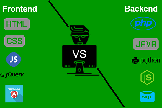
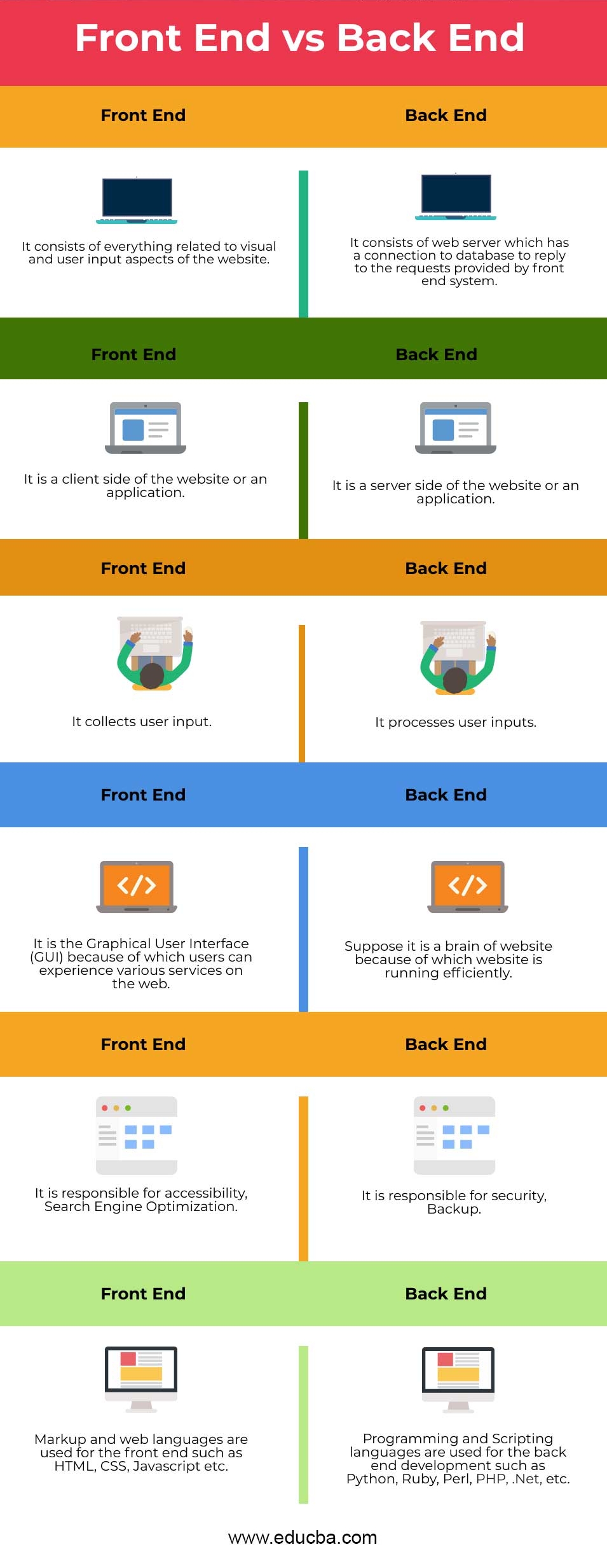
A tech stack is broadly divided into the client side (front end) and server side (back end).
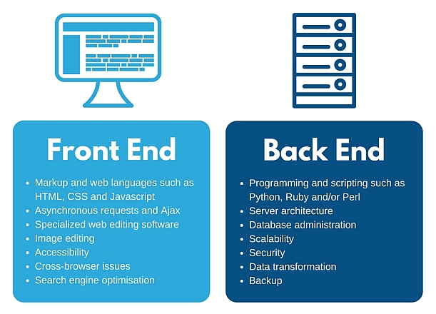
Front-end Developer
Front-end development refers to the client side, that is, a web-site's interactive features.
- Front-end developers are responsible for a web-site's user-facing code and the architecture of its immersive user experiences.
- Front-end developers work closely with designers or user experience analysts to bring mockups, or wireframes, from development to delivery.
Front-end developers must be adept at three main languages: HTML, CSS, and JavaScript programming.
- In addition to fluency in these languages, front-end developers need to be familiar with frameworks like Bootstrap, Foundation, Backbone, AngularJS, and EmberJS, and libraries like jQuery.
Back-end Developer
Back-end development refers to the server-side development.
- Back-end developers primarily develop and maintain the core functional logic and operations of a software application or information system.
- Back-end developers focus on databases, scripting, and the architecture of websites, along with the back-end code that helps to communicate the database information to the browser.
- A back-end developer typically has expert programming skills in Python, Ruby, C#, Java and other high-level programming languages.
Back-end developers also create and maintain the entire back end of a system, which consists of the core application logic, databases, data and application integration, API and other back-end processes.
- The key job role of a back-end developer is to ensure that the data or services requested by the front-end system or software are delivered through programmatic means.
- A back-end developer performs the testing and debugging of any back-end application or system.
- Knowledge of web services and the creation and consumption of REST and SOAP services is helpful.
Full-stack Developer
A full stack developer can work cross-functionally on the full stack of technology, i.e. both the front end and back end.
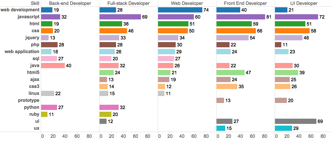
Comparison
Here are some figures detailing the differences between front-end and back-end developers: