


Section 1: Structural Tags
CSS Properties for Structural Tags
In the previous CSS notes we discussed several properties with respect to images and text alignment that also apply to structural tags.
- Borders, margins, padding, and background can all be used to format structural tags.
- In fact, the float property is invaluable as well.
-
If you look at the stylesheet for this page, you can see that the
specified styles for the <aside> tag make use of border,
background, and float:
aside
{
border:thin black dotted;
font-size:.8em;
font-style:italic;
background-color:cornsilk;
color:green;
float:right;
width:35%;
}
You can see the effect of the styles on the aside to the – wait for it – side!
Section 2: Demos
Demo Page #1
The first demo page includes a header, footer, and a section with two articles side-by-side.
- In the demo page the CSS is included as document-level CSS for ease of viewing.
- Note the use of the float and border properties.
- Note also the specification of clear:both for the footer. Try removing it and see what happens. (link)
Demo Page #2
The second demo page is rather elaborate.
- Here is the CSS file.
- This page has a header with an image, an h1 element, and a nav element.
- It has two sections, one of which includes a nav element and an aside element, and the other which includes a header, two articles (both of which include headers and paragraphs), and a footer.
- The page also has an independent footer.
- Take time to study both the HTML and the CSS.
- You may want to use this page as a template in the future.
Links
The second demo page has several excellent links, but here are a few more.
- 4 Methods For Creating Equal Height Columns In CSS (pre-CSS3)
- 50 Free Responsive HTML Web Templates for 2021 s
- Coding a layout in HTML5 and CSS3
- HTML5 Quick Tutorial
- Targeting HTML5's Semantic Elements with CSS
- Video: Html 5 tutorial - Basic structure
- Video: HTML5 - Semantic Page Layout
- Video: HTML5 Article Section Aside
Section 3: Box Model
Recall that each element in an HTML page defines a rectangular region, or box, that the browser uses to place the element in the browser window.
The following diagram shows the properties that make up the box model and how they relate to each other:
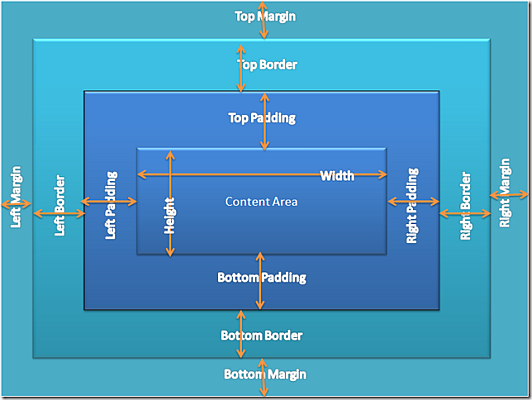
To calculate the height of a box when using the box model, you add the height of the content area to the sum of the heights of the top and bottom borders, top and bottom margins, and top and bottom padding.
Here is a good explanation of The CSS Box Model.
Section 4: Positioning
In CSS, each of these boxes has a position in three dimensions: height, width, and depth.
-
Three positioning schemes are used for the horizontal
and vertical positioning (along the x and y axes) of boxes
- the normal flow (which includes relative positioning)
- floating
- absolute positioning (which includes fixed positioning)
A discussion of relative, absolute, and fixed positioning will be deferred until a later set of notes.
Normal Flow
Normal flow is the default scheme used for positioning, but can be specified using position: static.
- It applies to any element that does not specify position: absolute or position: fixed and is not floated.
- In normal flow, boxes flow vertically starting at the top of their containing block with each placed directly below the preceding one.
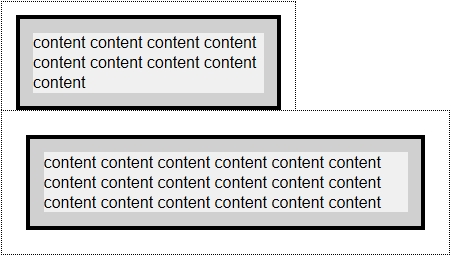
-
Vertical margins are collapsed in the normal flow. Instead of adding
the bottom margin of a box to the top margin of the one immediately
below it, only the larger of the two values is used, as illustrated
here.
Relative positioning changes the position of the HTML element relative to where it normally appears.
- If we had a header at the top of the page, relative positioning could be used to move it a bit to the right and down a couple of pixels.
Float
Float was covered in the Intermediate CSS notes.
More float notes:
- The float property is ignored for elements that are absolutely positioned.
- A floated box is taken out of the flow, so it doesn't affect the block-level boxes around it.
- When specified, the box is positioned vertically as it would be within the normal flow, its top aligned with the top of the current line box. But horizontally, it is shifted as far to the right or left of its containing block as possible, within that block's padding (just like other content). Surrounding inline content is then allowed to flow around the opposite side.
- Float only applies to elements that generate boxes that are not absolutely positioned.
- Things you should note regarding floated boxes.
- Adjacent floats.
Section 5: Overflow
This property specifies the behavior that occurs when an element's content overflows the element's box.
-
overflow: { auto | hidden | scroll | visible | inherit } ;
- The default behavior is to make the overflowing content visible, but it can be changed so that the content is clipped to the confines of the element's box, optionally providing a mechanism for scrolling the content.
- Specs
The CSS3 basic box model module adds to this by allowing the content to be clipped on just one axis.
- overflow-x controls the horizontal or left and right clipping
- overflow-y controls the vertical or top and bottom clipping
-
The overflow property can now be given two values; the first is the equivalent
of overflow-x and the second for overflow-y.
- If only one value is given it controls both axes, like previous behavior.
- More here.
- And here.
text-overflow
CSS3 also provides a text-overflow property so that when an element overflows its box and gets clipped, there is a visual 'hint' to the user that the text has been clipped, commonly the ellipsis: "…"”.
text-overflow comes into play only when:
- the box has overflow other than visible (with overflow: visible the text simply flows out of the box)
- the box has white-space: nowrap or a similar method of constraining the way the text is laid out. (Without this, the text would wrap to the next line)
Here are some examples:
Section 6: Let's Play
Click the "Edit and Click Me >>" to see the results of the html code in the left panel in the panel on the right.
Then, play around with the html code, making changes and seeing the effect of those changes in the right panel.