


Section 1: Introduction
At this point you probably have a sense of how easy it is to code a web page.
- What most people don't know is how much work goes into planning and developing a good design plan.
- The overall design of a website is critical to its success. (See also Visual Appeal vs. Usability: Which One Influences User Perceptions of a Website More?
A psychology professor at Carleton University in Ottawa found that Internet users judge whether they like or dislike a website in one twentieth of a second based on the web site's "visual appeal."
- Through the "halo effect" first impressions can color subsequent judgments of perceived credibility, usability, and ultimately influence purchasing decisions.
- Of those that visit only one percent make a purchase.
- Creating a fast-loading, visually appealing site can help websites succeed.
- This makes design considerations hugely important.
- Attention web designers: You have 50 milliseconds to make a good first impression!
Further, several studies have shown that the quality of page design Is an indicator of credibility.
- Elements such as layout, consistency, typography, color, and style all affect how users perceive your website and what kind of image you project.
- Your website should project not only a good image but also the right one for your audience.
- Other factors that influence credibility include the quality of the website's content, number of errors, and ease of use.
- 10 Useful Usability Findings and Guidelines
Section 2: Primary Considerations
Throughout the site design process, it is absolutely essential to remember two things: your purpose and your audience.
- Simple questions like 'what is this site for?' and 'who is this site for?' will dictate several smaller aspects of design.
Purpose
The purpose of the site should serve to remind you that functionality is much more important than appearance.
- Content is key here.
- A website can be the most beautiful page you've ever created, but if it doesn't serve its purpose then it's effectively worthless.
- Similarly, if the site takes a long time to load or is too difficult for people to navigate, then it's not likely to be very useful for either the user or the creator.
Some examples of web site purposes can be found in What is the purpose of a website? and What is the purpose of a website?, (Same name, different site) and include
- Informational
- Entertainment
- Professional
- Interactive
- Search
- Transactional
- Social Media
- Education
Audience
Defining the audience is a key step in the website planning process.
- The audience is the group of people who are expected to visit your website – the market being targeted.
- These people will be viewing the website for a specific reason and it is important to know exactly what they are looking for when they visit the site.
- A clearly defined purpose or goal of the site, as well as an understanding of what visitors want to do or feel when they come to your site, will help to identify the target audience.
-
Upon considering who is most likely to need or use the content, compile a list of attributes
common to the users such as:
- audience characteristics
- information preferences
- computer specifications
- web experience
Taking into account the characteristics of the audience will allow an effective website to be created that will deliver the desired content to the target audience.
Section 3: Site Structure
Site structure is a larger aspect of design that will often be decided by the purpose.
- If we have only a hazy idea how one section of the web site relates to other areas, or if we have no comprehensive narrative or clear sense of organization, the readers will know it soon enough, and most of them will leave in pursuit of better-organized material.
You could think of the structure of a website as how it would look if you printed every single page and arranged them on the floor of your room.
There are a few main structures:
-
Sequential
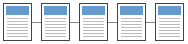 Sequential structures are linear in nature; they are well
suited for training or instructional sites.
Sequential structures are linear in nature; they are well
suited for training or instructional sites.- A sequential structure is the simplest way to organize information because it presents a linear narrative.
- Sequential ordering may be chronological, a logical series of topics progressing from the general to the specific, or even alphabetically sequenced, as in indexes, encyclopedias, and glossaries.
- Simple sequential organization usually only works for smaller sites (or structured lists like indexes), because long narrative sequences often become too complex to remain understandable.
- More complex web sites may still be organized as a sequence, but each page in the main sequence may have one or more pages of digressions or links to information in other Web sites.
-
Grid
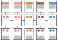 A grid structure is useful for information that shares a highly
uniform structure of topics and subtopics, with no particular hierarchy of importance among
the topics.
A grid structure is useful for information that shares a highly
uniform structure of topics and subtopics, with no particular hierarchy of importance among
the topics.- Many procedural manuals, lists of university courses, or medical case descriptions are best organized as a grid.
- Unfortunately, grids can be difficult to understand unless the user recognizes the interrelationships between categories of information, and so are probably best for experienced audiences who already have a basic understanding of the topic and its organization.
-
Hierarchical
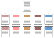 Hierarchical structures are useful for
organizing complex bodies of information, like Amazon.com.
Hierarchical structures are useful for
organizing complex bodies of information, like Amazon.com.- Hierarchical organization schemes are particularly well-suited to Web sites, because Web sites should always be organized as off-shoots of a single home page.
- Most users are familiar with hierarchical diagrams, and find the metaphor easy to understand as a navigational aid.
- Since hierarchical diagrams are so familiar in corporate and institutional life, users find it easy to build mental models of the site.
-
Web
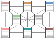 A web-like organizational structure mimics associative thought, like Wikipedia.
- The goal is to fully exploit the Web's power of linkage and association by allowing users to follow their interests in a pattern unique to each person who visits the site.
- Organizational webs are often the most impractical structure for Web sites, because they are so hard for the user to understand and predict.
- Webs work best for small sites dominated by lists of links, aimed at highly educated or experienced users looking for further education or enrichment, not for a basic understanding of the topic.
Most complex Web sites share aspects of all four types of information structures. Users are likely to use any Web site in a free-form "web-like" manner, just as most reference books are used.
However, the nonlinear usage patterns typical of Web surfers do not absolve the designer of the need to organize the content and present it within a clear, consistent structure that complements the design goals for the site.
Section 4: Page Design
For any website the first design consideration should be usability.
- The primary reason for the website is the user of the website.
- According to sites like the Web Design Reference Guide, a client's web site is not the place for a web designer to get creative and build works of art.
When it comes to actually designing pages, there are literally hundreds of things that could be discussed, but we'll cover only the most important aspects of page design.
Layout
Make sure important content is placed toward the top of pages, as some users are lazy and may not feel like scrolling down to find what they're looking for.
- Think of the top of your pages as prime real estate, don't waste it with non-essential content that could just as easily be placed in the body of the page.
- It is clear that many designers, including the designers of ISU's web content
management system, feel this guideline is obsolete, but are many reports that indicate that it is still
important.
- In The Fold Manifesto: Why the Page Fold Still Matters, the Nielsen Norman Group recently concluded that "what appears at the top of your page matters. Users do scroll, but only if what�s above the fold is promising enough. What is visible on the page without requiring any action is what encourages us to scroll."
- See also
This doesn't mean you should cram everything in the upper area of the page, just that you should make the best use of that area.
- Crowding it with content will just make the content inaccessible; when the user sees too much information, they don't know where to begin looking.
Also consider page size and layout.
- Try to avoid text that crowds the edges of the browser window.
- Remember white space!
Fonts
Some sites look great if and only if you use a certain font, and since it's not guaranteed that all of y our visitors will have that font installed, you need to be aware of tools like @font-face, which allows the browser viewing the web page to download a particular font from a server to render the page if the user has not got that font installed..
- Use standard web fonts such as Arial, Times, Courier, Georgia, Verdana, etc.
- Avoid controversial fonts like Comic Sans.
- You can find more on design principles and font selection in The Anatomy of Web Fonts.
Colors
Subtle things like color choice can end up making a big difference on the overall design of a page.
- A soft color shade or white usually makes the best choice for background.
- Be careful not to go overboard with colors; they should suit the theme and purpose of the website.
- Text should be of sufficient contrast to the background to be readable.
- Too many colors, clashing colors, or very garish colors all distract (and detract) from your site's content.
- Stick to a simple palette and use it consistently.
- However, you can find conflicting recommendations. 2021 Web Design Trends and Standards recommends muted colors, while A guide of UI design trends for 2021 feels vivid colors are best.
The Institute for Color Research reports that when humans assess an item like a web page, between 62% and 90% of that assessment is based on color alone.
- It is important to set the tone for the user by picking colors that compliment the purpose of the website.
- Each color provides a different feel to the website.
- Compare this same site, first using their original color scheme and then the modified color scheme.
White Space
White space is the empty space between paragraphs, pictures, buttons, and other items on the page.
- White space de-clutters a page by giving items room to breathe.
- Items can be grouped together by decreasing the space between them and increasing the space between them and other items on the page.
- This is important for showing relationships between items (e.g., showing that one button applies to a particular set of items) and building a hierarchy of elements on the page.
White space also makes content more readable.
- A study (Lin, 2004) found that good use of white space between paragraphs and in the left and right margins increases comprehension by almost 20%.
- Readers find it easier to focus on and process generously spaced content.
Consistency
It should go without saying, but once you come up with a design, you should use it consistently.
- Doing so will help to establish a site's identity and will help to decrease confusion for your users.
- Consistency makes sites easier to use, because visitors don't have to learn new tricks as they move around.
Sites should be internally consistent: standards and conventions should be established and applied throughout all the content.
- For example, a user who encounters the "Search" at the top right on one page will have problems if it's arbitrarily moved to different locations on other pages of the site.
Sites also need to be externally consistent, that is, consistent with general practice.
- Users will tend to apply rules they've learned elsewhere, even if those rules don't actually apply to the current site.
- They bring to your site their own experience and expectations.
- If you ignore that, you risk causing confusion and alienation.
Consistency should apply to (at least) the following:
-
Language
-
The use of multiple terms for the same thing is a significant cause of confusion.
- You can minimize this confusion by using only commonly accepted terms.
-
You should also have a consistent "voice".
- Don't switch from warm-and-friendly on one page to legalistic and threatening on another.
- Consistent language will make your site appear simpler and more authoritative.
-
The use of multiple terms for the same thing is a significant cause of confusion.
- Component Arrangement (Layout)
- Existing general practice constrains what you can do because people have come to expect certain things.
- People have a strong memory for location, and your designs can leverage this characteristic by reserving particular locations for screen elements (navigation, search, login, content) and applying them consistently.
- The company logo should appear at the top left of the page, navigation on the top or left (or both), content in the center of the page, related material and promotions on the right, search on the top right, and contact info in the footer.
- That said, layout preferences evolve over time. For example, the hamburger menu was popular, then it wasn't, so things like menu recommendations are not consistent.
-
Look and Feel
- Look and feel applies not only to the obvious elements like logos and navigation, but also to content elements, fonts, and backgrounds.
- The use of CSS can help ensure the consistency of these elements.
- Strive for consistent presentation of content throughout the site.
- Primary navigation is immediately apparent and secondary and subsidiary navigation is immediately identifiable.
- Use consistent layouts, colors, and fonts.
Form Fields
Form fields can be a source of annoyance for users.
-
Always place the cursor in the initial field because users should not be required to move the mouse
pointer to the first data entry field and click on the mouse button to activate the field.
- Users assume that they are in the initial field and start typing, and can get frustrated if their input is ignored or placed in the wrong field.
- Users should also be able to tab to move the cursor to the next item in the sequence.
And always provide guidance for user input.
-
If a form asks for telephone number without any indication of the format that is required,
the user could enter (XXX) XXX-XXXX, or XXX-XXX-XXXX, or XXX.XXX.XXXX.
- If the form then tells them they used the wrong format, they will again get frustrated.
- And keep in mind that not all visitors come from the US, and international phone numbers often use a different format.
- The HTML placeholder attribute can be used with form fields to provide guidance to users.
Form Design: 13 Empirically Backed Best Practices
Resolution
When it comes to display resolution, the most common screen resolution is 1920x1080 (as of 2021).
- However, the browser's viewport width is more useful, because your page renders inside the viewport, not on the entire screen.
- Screen resolution: The ultimate guide has a useful discussion.
Browser Compatibility
Your site should be able to be displayed correctly for all users.
- This may sound obvious, but there are several factors that affect this.
- Things like browser compatibility, display resolution, and font choices are all important things to consider.
Remember that just because you use Chrome or Firefox doesn't mean everyone else does.
- As a web designer, this means you must cater to a variety of browsers.
- To avoid display errors make use of web standards.
- This will help ensure that the page renders correctly in Chrome, Firefox, Opera, Safari, etc.
Accessibility
Remember to make your site accessible to users with disabilities, such as blind users using screen readers, blind users using Braille readers, low-vision users using screen magnifiers, and motor-impaired users.
Here are some examples of things you can do to increase access:
-
Perceivable
- Provide text alternatives like the alt attribute for any non-text content so that it can be changed into other forms people need, such as large print, braille, speech, symbols, or simpler language.
- Create content that can be presented in different ways (for example simpler layout) without losing information or structure.
- Make it easier for users to see and hear content.
-
Operable
- Make all functionality available from a keyboard.
- Do not design content in a way that is known to cause seizures (exclude anything that flashes more than three times in any one second period). Link
- Provide ways to help users navigate, find content, and determine where they are.
Follow the Web Content Accessibility Guidelines.
Links
- Designing for accessibility is not that hard
- Accessible Web Design
- Accessibility Basics
- Beyond ALT Text: Making the Web Easy to Use for Users with Disabilities
- 10 Examples of ADA Compliant Accessible Web Design
Miscellaneous
Other small things will distinguish a great website from a good one.
- Remember to specify image and table widths and heights, it prevents layout shift.
-
Always give your pages a good title.
- Title tags are displayed in the browser's title bar, in browser tabs, browser bookmarks, and in search results, and are a very important part of on-page search engine optimization.
Section 5: Things to Beware
Once again, there's a laundry list of things that could be discussed here, but for the sake of brevity, here are the more egregious web design sins.
Too Many Images
Pictures, while useful, should not be overdone.
- The fact is that some users (although a shrinking number) still use dial-up connections to access the Internet, and pictures require bandwidth.
- Use them effectively, but not excessively.
- If your page takes longer than 5 seconds to load, you might be overdoing it a bit.
As we established earlier, users judge the page quickly, but also users will only wait about 5 seconds for a page to load before moving on.
- A good guideline for page size is less than 30k.
- However this does not mean you should add a bunch of small images if you stay below 30k.
- Each image requires a separate HTTP request, so a lot of small images will slow down the page load as easily as a big image.
- If your images were taken with a digital camera, check the file size and use image scaling if necessary.
Another hint is to set the height and width attributes.
- This helps load the page fast because the browser will know how much space each image takes up.
Pop-ups and Pop-unders
Useless pop-ups are the scourge of the Internet.
- Don't use them on your site unless it's absolutely necessary.
- Pop-unders are absolutely evil and should never be used by a reputable site.
Disguised Links
One last thing – users should be able to distinguish a link from text based on either color or underlining.
- Why hide stuff from your visitors?
- See Mystery Meat Navigation.
Miscellaneous II
You might want to take time to read Biggest Mistakes in Web Design or Top-10 Application-Design Mistakes.
Section 6: Resources
- Web Pages That Suck
- Common UI/UX Mistakes That Can Destroy Your Website Design
- 10 Highly Effective Web Design Tips Backed by Research
- 27 Research-Backed Web Design Tips: How to Design a Website That Works
- 12 essential tips for improving your web design in 2021
- 9 Professional Web Design Tips
- 9 Guidelines & Best Practices for Exceptional Web Design and Usability
- Top Web Design Trends for 2022